Tringg is a B2B2C provider of innovative technology solutions to food and beverage businesses and their patrons. One thing that diners and restaurants agree on is that the guest experience must be, first and foremost. In the end, nothing will make up for a substandard meal, poor service, long wait times, or an undifferentiated dining experience.
Tringg diner app enables the diner to explore the restaurant’s menu, place their orders, and pay securely from the comfort of their mobile phones.
PROJECT OVERVIEW
What was the business challenge we wanted to solve with Tringg?
- Create a direct table to kitchen ordering system for the restaurant and their patrons.
- Reduce the workforce dependency of restaurants.
- Create a better in-restaurant experience for the diners.
- Help manage the order process of a restaurant more efficiently
Why was this challenge important to solve?
- In the current restaurant market, the cost of training and hiring a workforce is expensive and the attrition rate is high too in this job. A restaurant spends approximately around 12-22% on the waiting staff.
- Time per table turnaround is high in restaurants due to delays in the waiting and serving process.
- For diners, the experience is not seamless and is prone to human errors.
Which tools were used to execute the project?
- Adobe XD to design the screens
- Adobe Suite to design the graphic elements
- Zeplin to handover the designs to the developers
- Miro for collaboration with team members
- Trello to maintain and follow an Agile work process
Objectives
- Design an easy and user-friendly mobile app for in-restaurant ordering and payment
- Create a Branding Strategy for Tringg
Role
- Stakeholder
- Product Designer (Research, Visual Design, Interaction Design & Usability Testing)
Tools
- Adobe XD
- Adobe Suite
- Zeplin
Team
- Self executed Product Design, with feedback from colleagues and mentors.
- Manish Singla (UI Design - 32 Screens)
Timeline
July '19 to October '19
MY DESIGN PROCESS
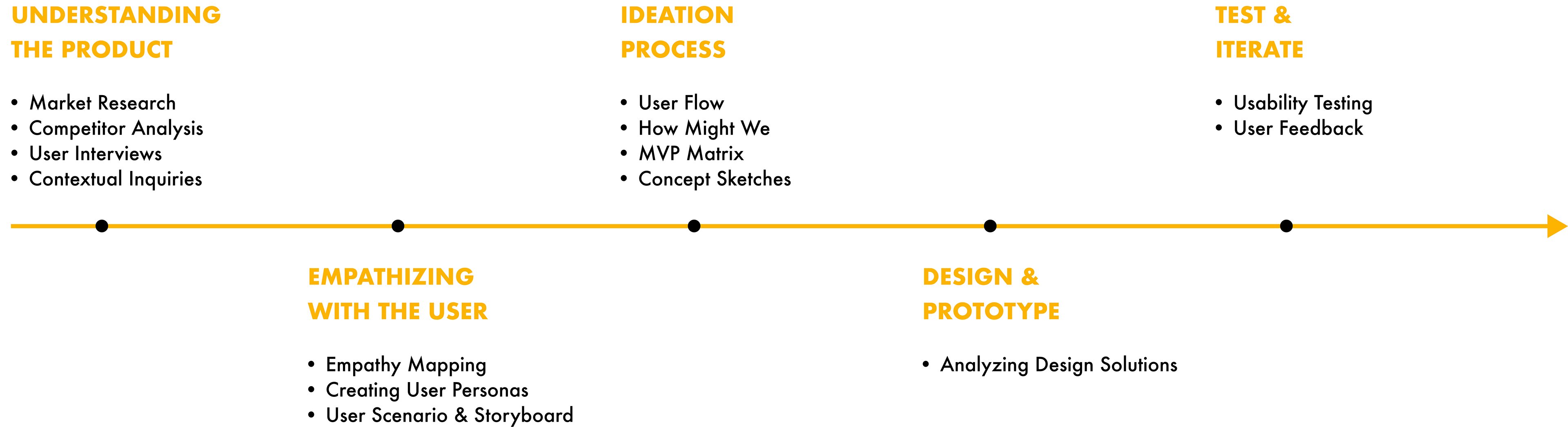
UNDERSTANDING THE PRODUCT
MARKET RESEARCH
To understand about the product at hand, we initially conducted a market research, where restaurant managers and potential diners were interviewed to understand the impact of a product like Tringg on their experiences.
To give the research a path, a research document was created to keep the research on track and to act as a guide for future teams working on the product. Research goals, questions, methodologies, findings and timelines were put down in the document which you can access by clicking the button below.
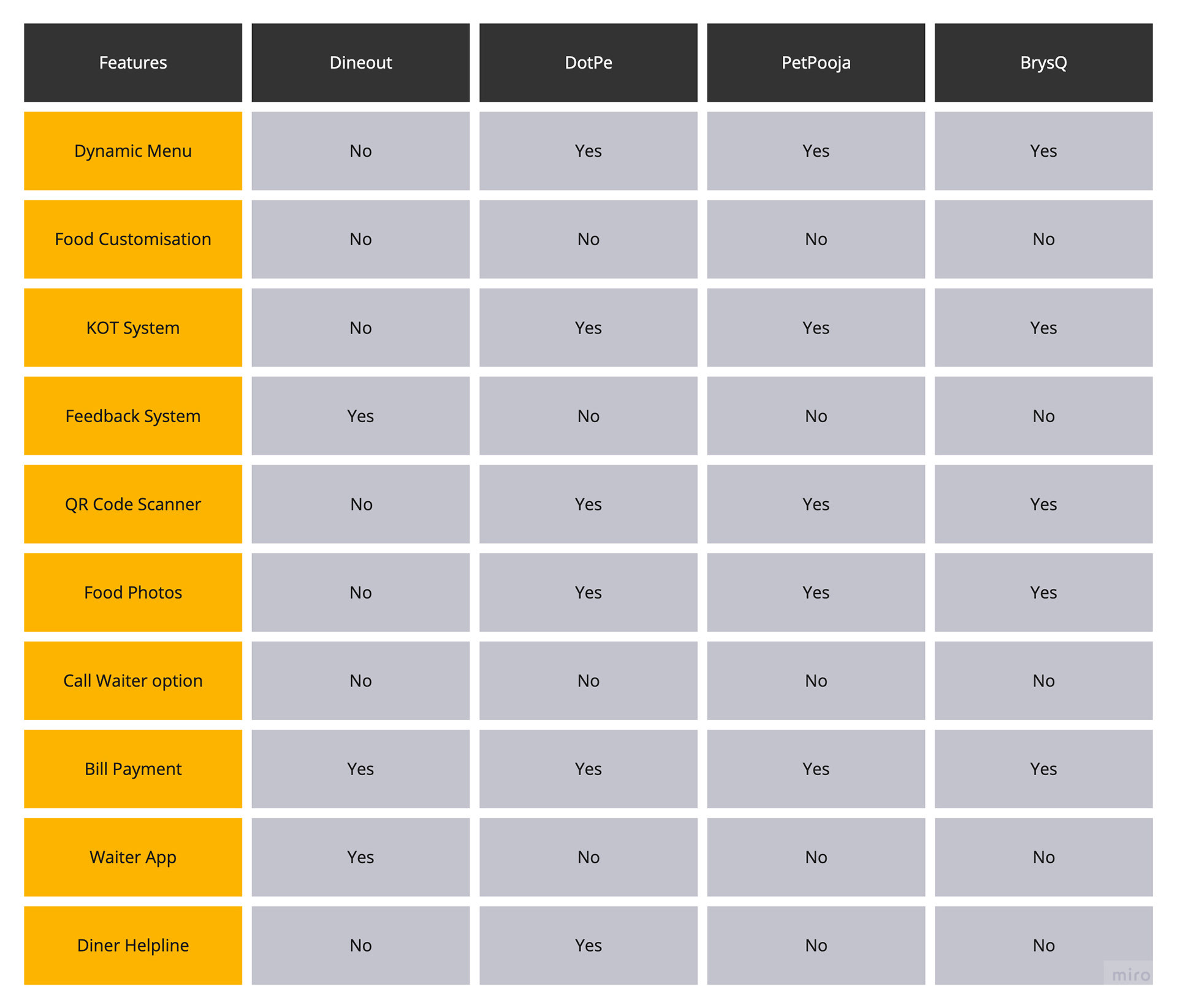
COMPETITOR ANALYSIS
Based on our research of our competitors and analysis of their applications we were able to draw a clear picture of how they operate and what they offer to the users. With our User research we gained further understanding as to what the users might expect in an in-restaurant ordering app and how Tringg could improve that experience.
To draw a comparison with Tringg, we took into consideration a few features from the competitors' apps along with a few novel features.
USER INTERVIEWS
Instead of online surveys, we conducted a group discussion to get people to discuss about the issues they face in restaurants. Six people from the target group were selected for the process. The topic of discussion was set as 'The Restaurant Experience - The good and the bad'. While the discussion was being conducted, the issues raised were documented by the moderator.
Key findings & Insights
1. Slow service at a restaurant.
2. Inadequate number of menus are shared amongst one table, which is time consuming.
3. Incorrect/missing items from the order due to human errors in communicating the order.
4. Longer payment processing times with many steps involved to clear a bill.
5. Limited payment integrations to pay the bill.
6. Difficulties in splitting the bill, while dining with a big group.
CONTEXTUAL INQUIRIES
The participants for the contextual inquiries were identified as 3 popular sub-urban restaurants in Mumbai and the sessions were conducted on weekends to observe the restaurants run with a full staff.
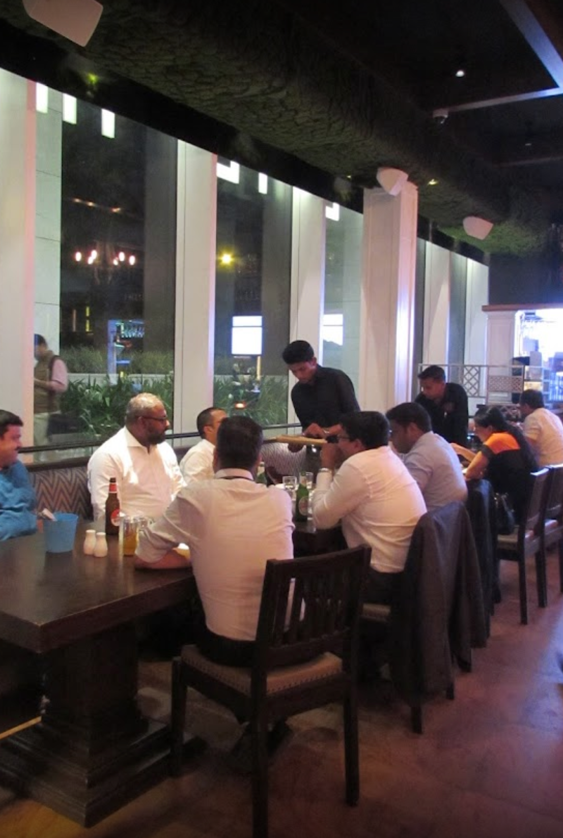
Butterfly High

Doolaly Taproom
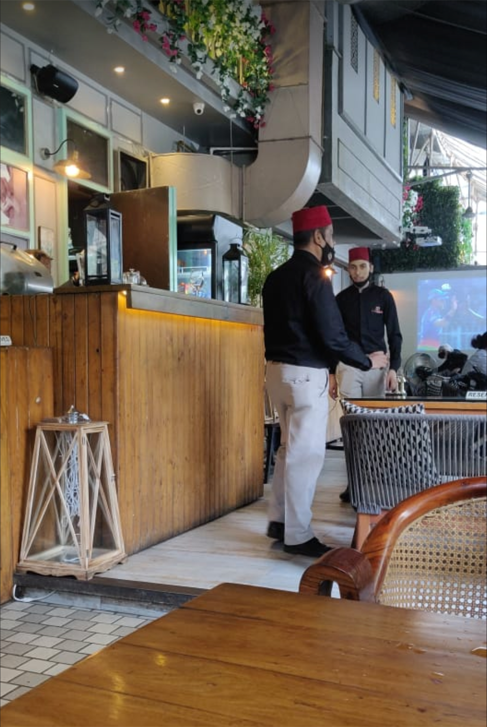
Arbab
For the contextual inquiries to be conducted, we identified the key research questions below:
1. What is the process waiters follow in a restaurant?
2. What is the average time for a waiter to tend to a table?
3. In what scenarios does a diner call for a waiter?
4. What steps are followed to prevent errors? And how are errors rectified?
5. Do the waiters use any tool/app to help them with the tasks at hand?
Key findings & Insights
1. Order taking process was delayed on many tables during rush hours.
2. Waiters were not clear about the process to change and cancel orders.
3. Waiters committed errors in communicating orders to the kitchen.
4. Less number of card machines and lack of other payment channels led to delay in payment for many tables.
5. Handwriting on the KOTs were ineligible at times for the kitchen staff to read, leading to errors.
Empathizing with the User
EMPATHY MAP
An empathy map was created by synthesizing the research data which helped us understand the user better. Using this empathy map, we were able to chalk out a specific user persona.

USER PERSONA
Based on the user research and the empathy map, one persona was identified. While designing the user experience, the persona was used to create user scenarios and eventually personify the end user of the mobile application.

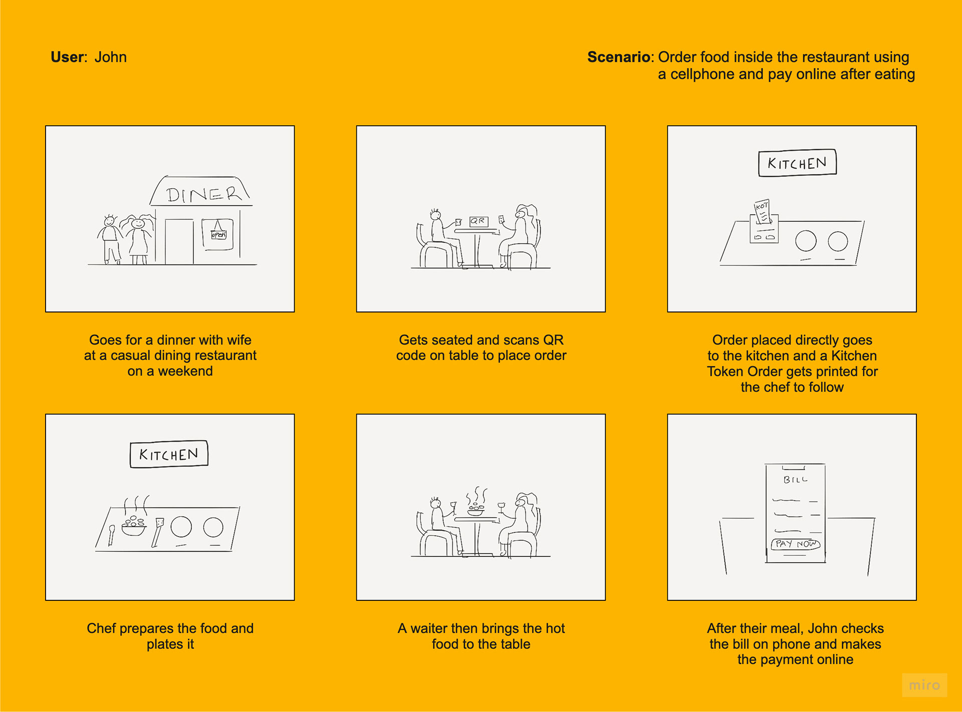
USER SCENARIO & STORYBOARD
Based on the insights we gathered from the research, user scenarios were formed. Using the scenarios I sketched out storyboards to lay down the possible interaction between a user and the proposed product. This exercise gave us some insights into user behaviour inside a restaurant, which helped us to design the user flows for the product.
Ideation Process
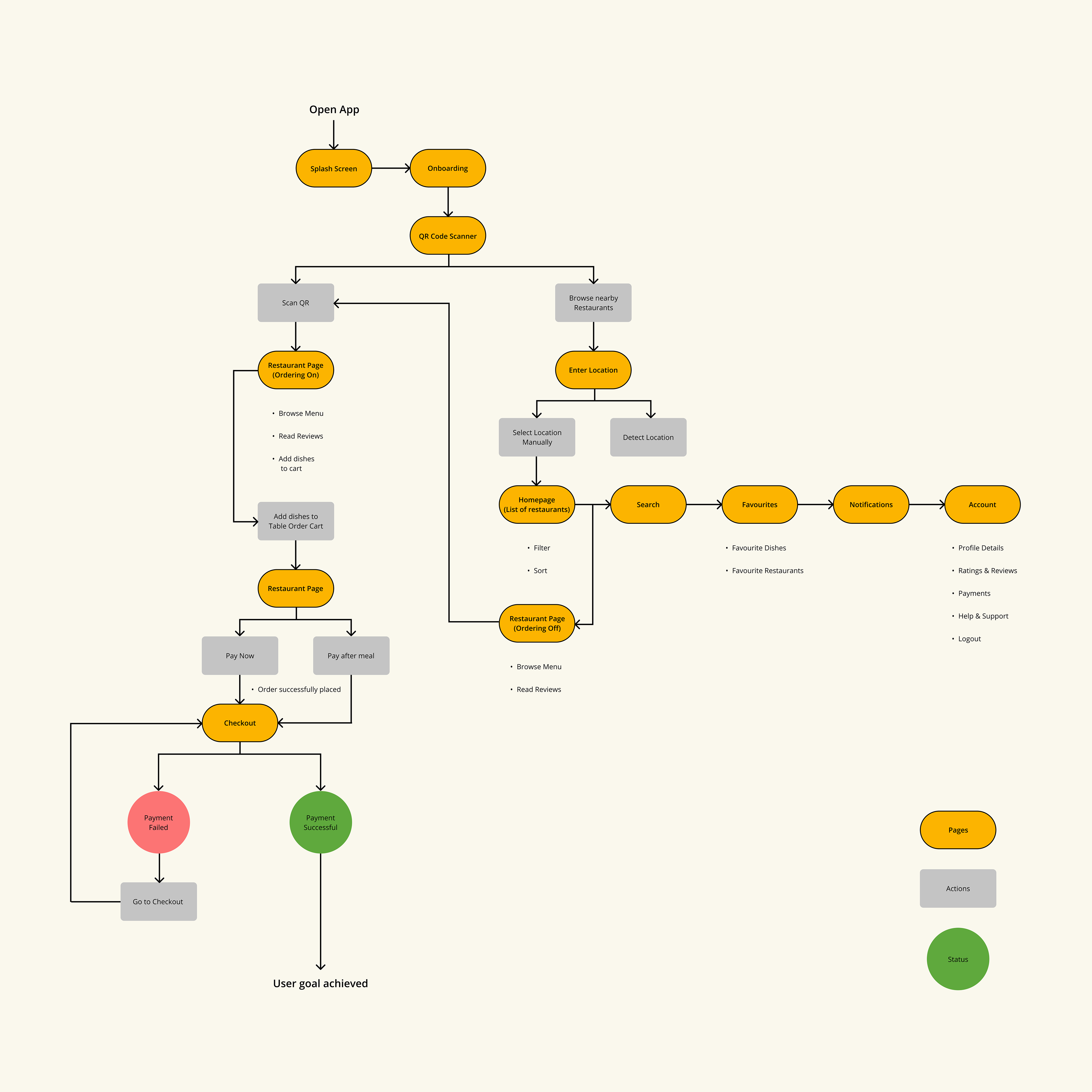
USER FLOW
User Flow diagram was created to consider the path in which the user will navigate through the application. This path is divided into a series of steps that the user takes from the entry point, through various funnels towards the final action of ordering from the restaurant table.
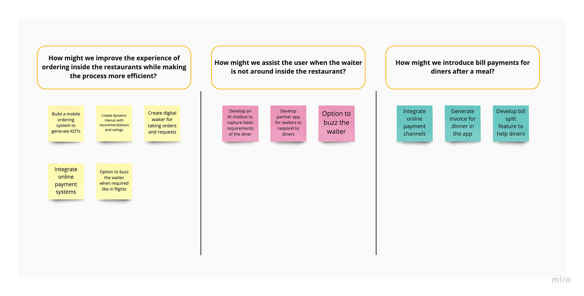
HOW MIGHT WE
After the findings from the Market Research, User findings and the Competitive Analysis, we conducted a How Might We session to brainstorm and find solutions to solve the problems at hand. After we identified the How Might We questions which needed to be addressed, each participant of the session was directed to post their proposed solution under the respective questions.
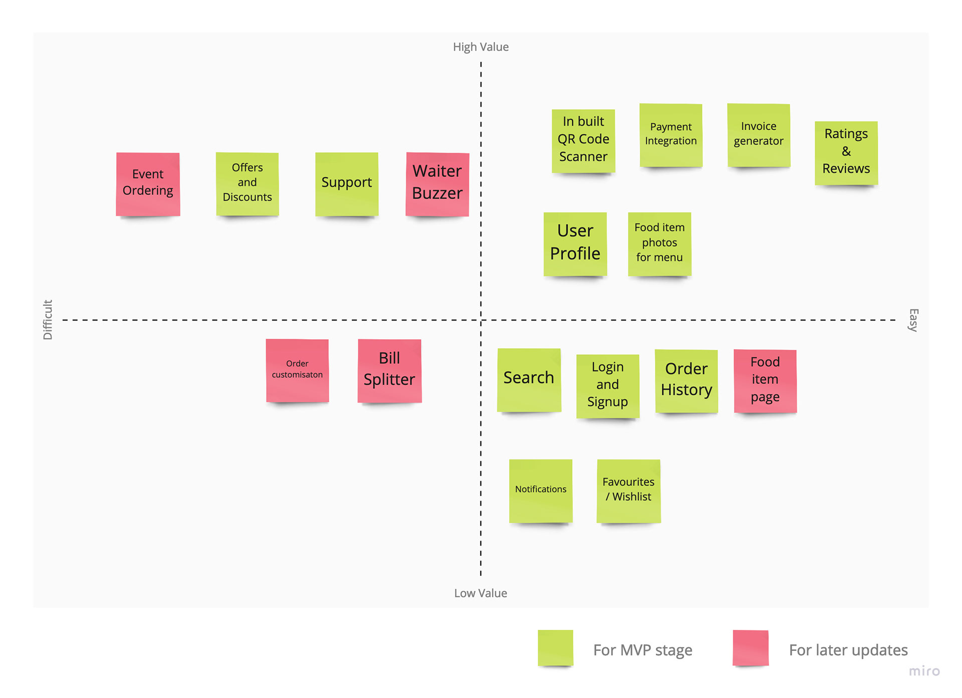
MINIMUM VIABLE PRODUCT MATRIX
Next step was to list all the features and solutions we gathered from the above exercises. As the product development was bootstrapped, we decided to prioritize the features as per the limited resources we had at our disposal. This led us to working on a Minimum Viable Product matrix, which helped us prioritize the features keeping the business goals in mind.
This exercise required all the stakeholders, developers and the product team to participate and come to a unanimous decision with respect to the features which would be developed in the MVP phase.
CONCEPT SKETCHES
After brainstorming the features for the MVP phase, screen sketches were created to have a clear idea of how the MVP would function. This exercise helped us in making better design decisions and in visualizing the product ideas.
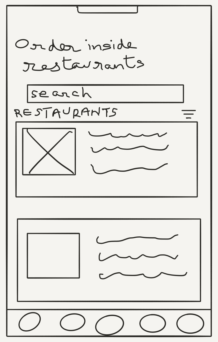
Homepage

QR Scanner
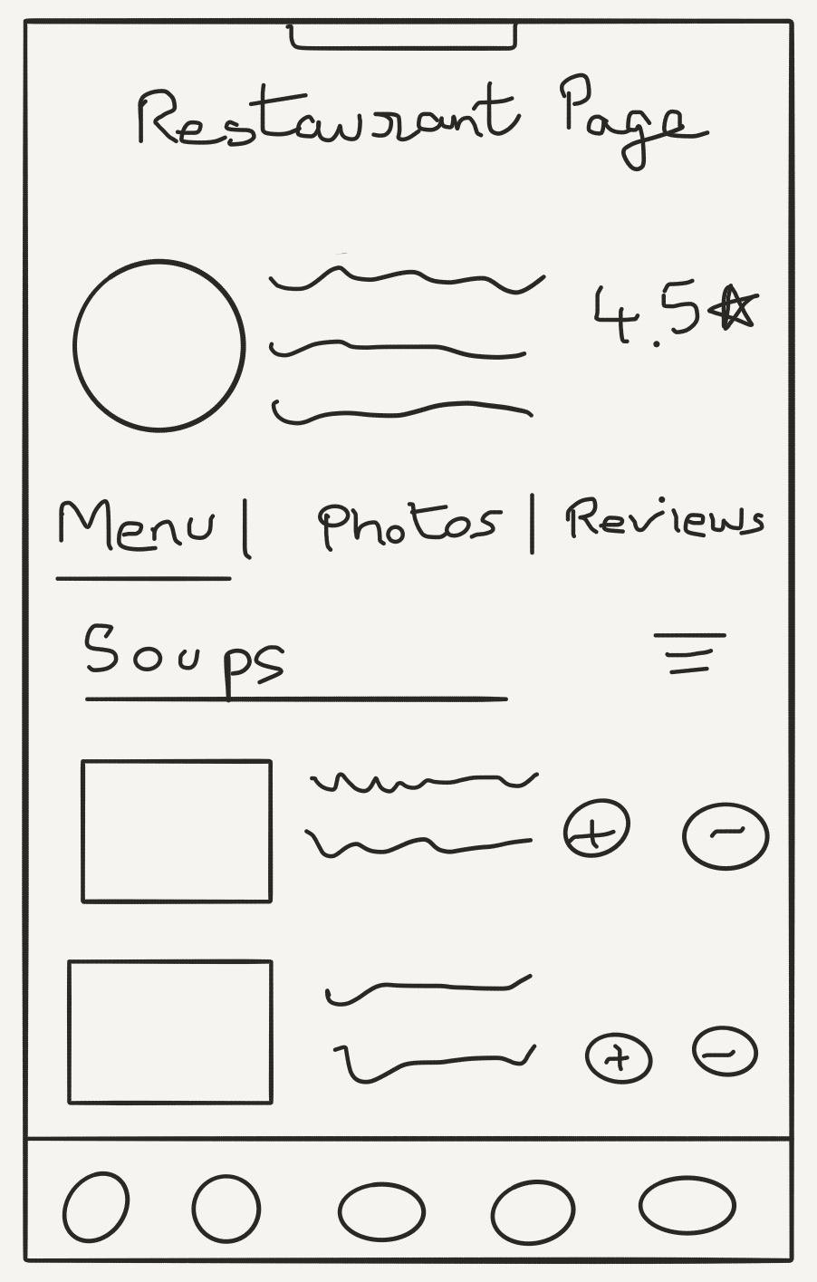
Restaurant Page
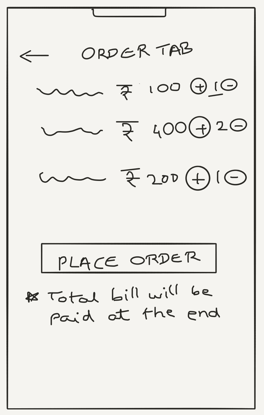
Ongoing Order Tab
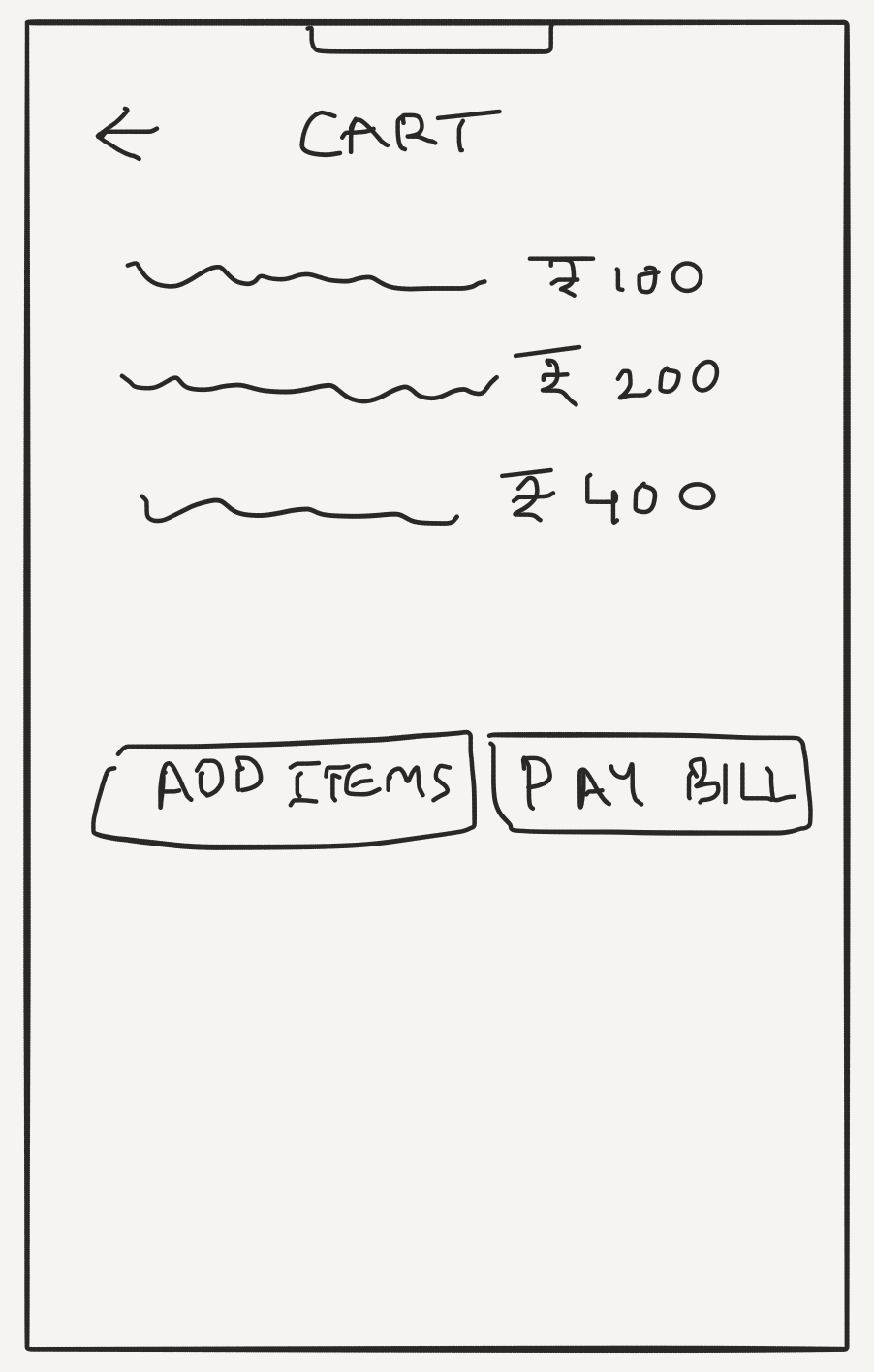
Cart Page
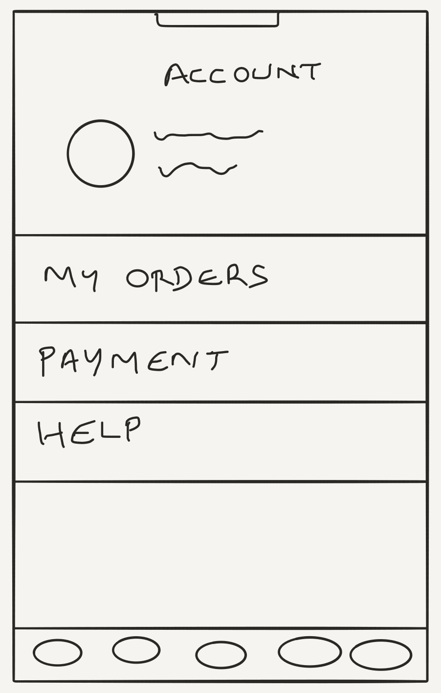
My Account
Design
ANALYZING DESIGN SOLUTIONS
Based on the initial defined user flows and concept sketches, we achieved the design for the MVP stage, which includes the restaurant listings, order flow, QR code scanner and payment flow.
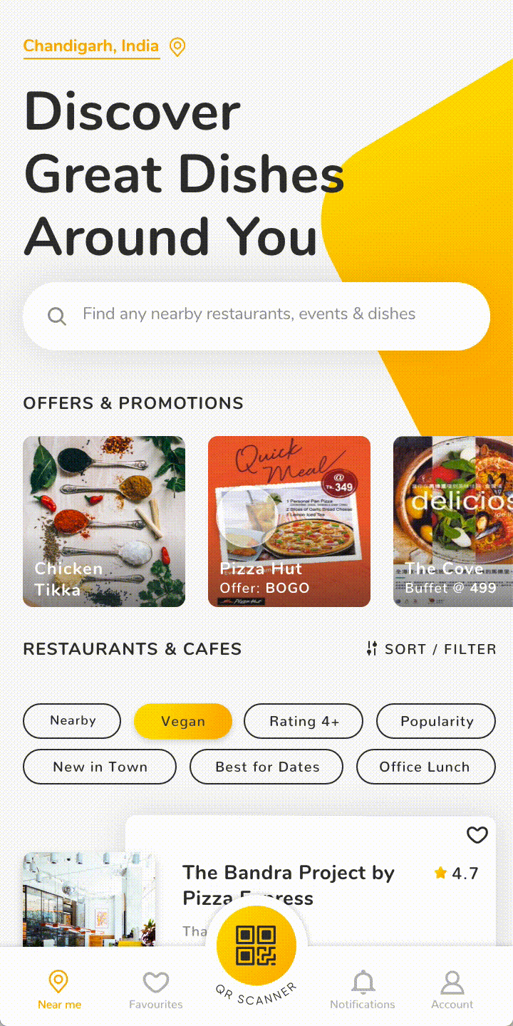
Homepage
Quick Filters - Providing an easy way for users to find preferred
restaurants.
restaurants.
Restaurant Card - Giving necessary information on the card to help users know more about the restaurant.
QR Scanner Button - Quick access to QR code scanner to scan the QR code inside a restaurant.
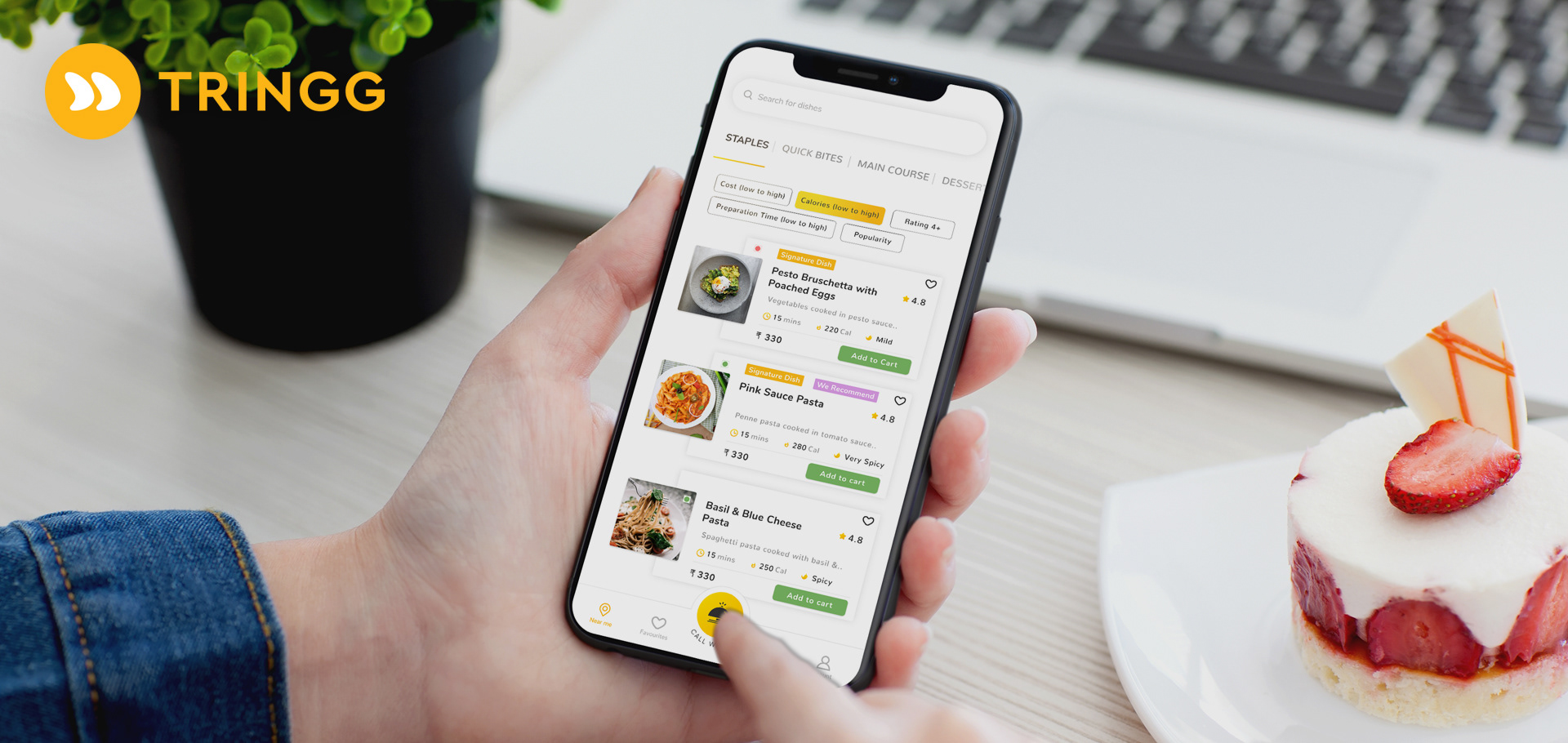
Restaurant Menu
Dish Card - Each dish has a card with information to help the diner choose a dish faster, such as price, calories, and time to cook.
Quick Filters - Quick filters enable the diner to find dishes according to their preferences and makes the decision making process faster.
Categories - Categories can be accessed with a floating button on the right bottom of the screen. The floating feature enables the diner to change the categories easily without scrolling.

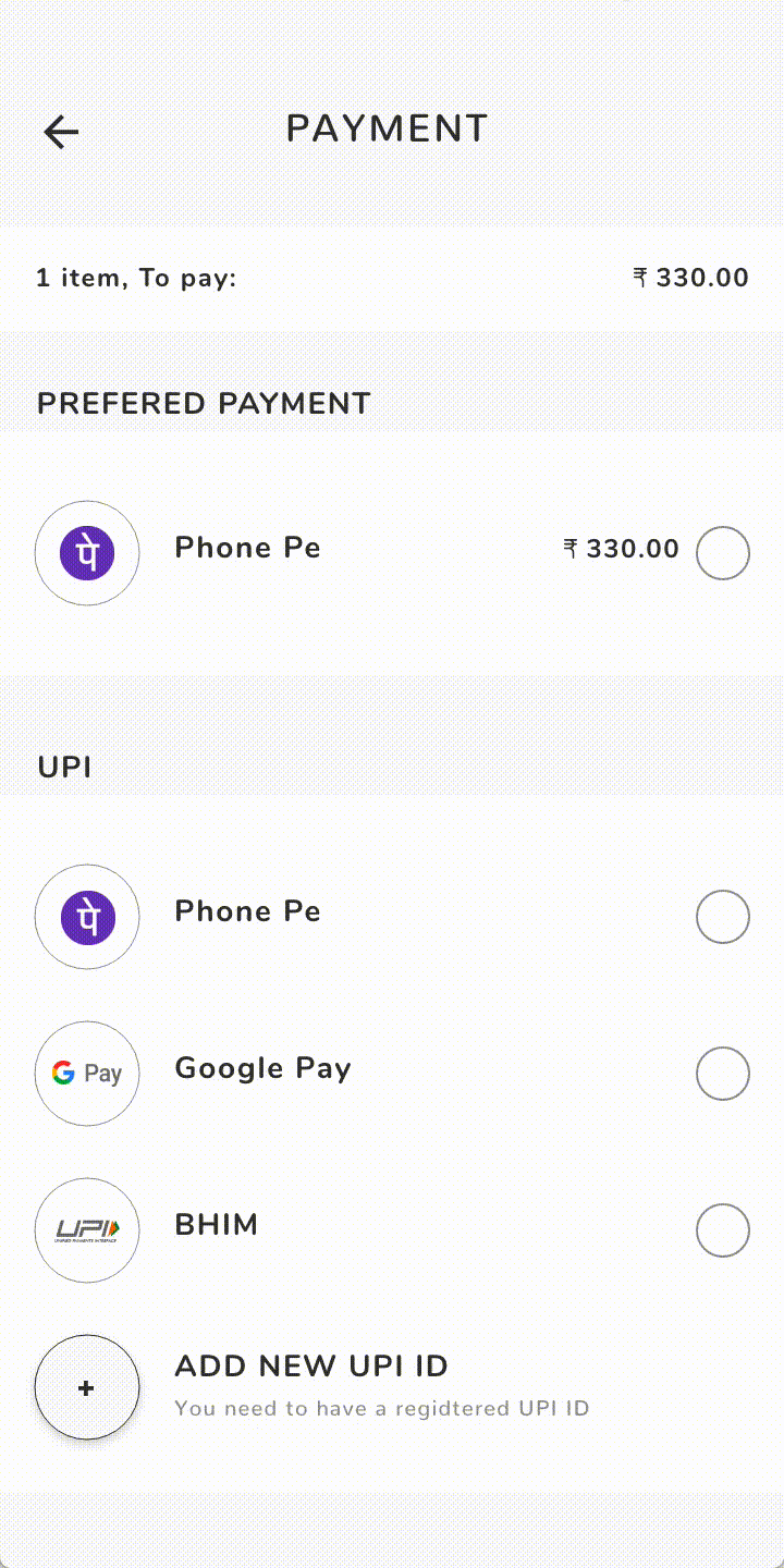
Payment
Multiple Payment Channels - The diners will be able to pay through multiple payment channels.
Preferred Payment method - The diners can pay swiftly using their preferred payment method, which is pinned to the top of the list.
TEST & ITERATE
USABILITY TESTING
After finalizing the designs for the first edition of the MVP, we conducted a moderated usability test at a partner cafe in Mumbai. Our goal was to test a number of features in the product and reveal usability problems if any. For the test, we onboarded 5 fresh eye users, who aren't familiar with the product, and asked them to complete a specific set of tasks. We used the User Persona as a reference to onboard users for the test.
Goals for the Usability test
1. Validate restaurant ordering & payment flow
2. Check QR code scanner usability
3. Validate bottom navigation menu
4. Validate menu design
5. Validate card designs for dishes and restaurants.
Key tasks for the user
1. Find a restaurant you want to visit and scan the QR code.
2. Place an order from the menu.
3. Checkout and make the payment.
After the usability test was conducted, we identified these Interview Questions to get more insights from the users
1. Can you name some competitors of this product?
2. What features did you find helpful and why?
3. Would you consider using this app in a restaurant?
4. What do you think about the design?
5. Did you get stuck at any task?
6. If you could change one thing in this product, what would it be and why?
7. What new features do you expect to see in our product?
DESIGN ITERATIONS
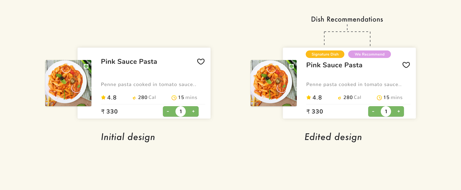
1. Individual Dish Card
While testing, 3 out of 5 users wanted food recommendations from the Cafe manager. While working on design iterations, in order to make the process of dish selection easier for the user, we introduced recommendation tags in the dish card itself.
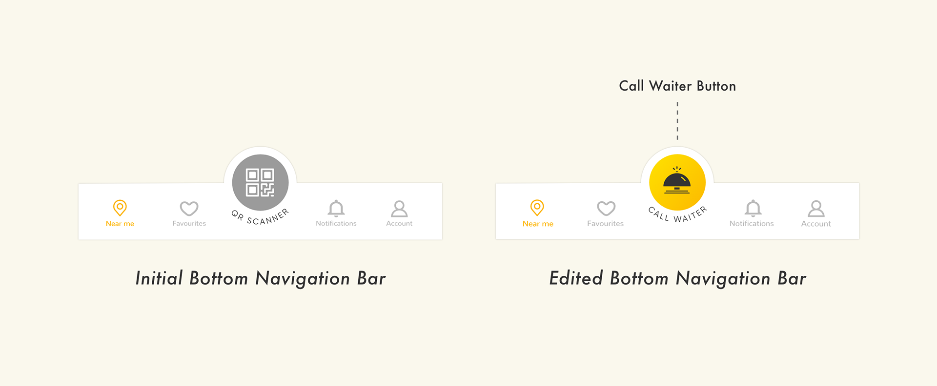
2. Call Waiter Button
It was observed that when the Cafe had a bit of a rush on the weekend, the users were having a difficulty to get the waiter's attention. To solve this issue, we redesigned the Bottom Navigation Bar. After logging into a restaurant by scanning the QR code, the QR Code button will change to Call Waiter button, which the user can use to buzz the waiter when needed.
LEARNINGS AND ROADMAP
WHAT I'VE LEARNED
While working on this project, it was important to understand the constraints we were working under. As we were designing an MVP, we had to constantly check for the limitations our team had. This required effective and constant communication with the business stakeholders and the development team. We also had to make sure we were solving the right problem and not swaying away from the bigger picture, i.e. to make the in-restaurant dining a hassle free experience for both the diners and the restaurant stakeholders.
NEXT ITERATION
1. Bill Splitting
We have decided to go ahead with Bill Splitting as a feature to the checkout process and adding other diners to the table. This allows the user to split the bill and make his part of the payment in the checkout process itself.
2. Conversational UX for Call Waiter
We also decided to work on enhancing the feature of Call Waiter and make it more effective. Currently if a diner calls for a waiter by pressing the Call Waiter button, the waiter has to visit the table to know the nature of the problem the diner has. Adding a conversational screen to the step will inform the waiter about what the user needs exactly which will help the waiter be more efficient.
--------------------------------------------------------------
Fin.
Thank you!